Abstract
** This article has been featured in Towards Data Science.** Being able to predict crop yields can have big and wide impact, for example related businesses can use this model to optimize their price and inventory, government can prepare for food shortage, even farmers can be informed of appropriate selling price if they know the regional yields. Here we show that one could predict the yield using satellite images using corn as an example crop.
This project aims to tackle this data using a data-driven
approach, particularly we hope to:
● Identify
correlations between satellites images and crop yields.
● Build a regression models to
predict yields from these images using data from year 2010-2015 as a training
and yields in 2016 as a test set.
● Determine
how early can we accurately predict the yields.
Data Sources
I queried images in county level from 4 satellites with 38 time points through
Google Earth Engine including 1) MODIS Terra Surface Reflectance, 2) MODIS
Surface Temperature, 3) USDA-FAS Surface and Subsurface Moisture, and 4)
USDA-NASS for masking (total of 146 GB). Each of the images from the first 3 satellites
were collected every 8 days from March to December (total of 38 images per county per year,
each with 11 bands total). The ground truth annual yields were collected in a
county-level from USDA QuickStats.
Results and Conclusions
Using combination of convolutional neural network and recurrent neural network, we were able to predict the corn yields with only 10% error on average if we used all 38 frames of images taken in a year. In most major corn production county (mid west counties), the errors are even lower (<5%). However, since we want to do early prediction, we reduced the number of frames used per year and found that reducing it to just 20 frames still resulted in acceptable error of 15% on average. The 20th frame of the year correponds to the month of August, which is 2 month before corn is typically harvested in October (or even later in warmer States). Therefore, this model would allow user to be able to predict corn yields at county level early in the season.
A more detailed code and notebook can be found here.
Full Detail
1.
Introduction
Growing up in a family whose business is primarily distribution of agricultural produce, it is always a challenge deciding when we will sell the product, and for how much as these ultimately depend on how much of the produce will be harvested at the end of the season. If there is a way to predict how much will be obtained at the end of the season, we would be able to make decision much easier. Previous studies were able to show that satellite images can be used to predict the area where each type of crop is planted [1]. This leaves the question of knowing the yields in those planted areas. To this end, this project aims to use data from several satellite images to predict the yields of a crop. We chose corn as an example crop in this study. The implication for this project is much more than just my family business of course, big businesses can use this model to optimize their price and inventory, government can prepare for food shortage, even farmers can be informed of appropriate selling price if they know the regional yields.
This project aims to tackle this data using a data-driven approach, particularly we hope to:
● Identify correlations between satellites images and crop yields.
● Build a regression models to predict yields from these images using data from year 2010-2015 as a training and yields in 2016 as a test set.
● Determine how early can we accurately predict the yields.
Solutions to all problems start with gathering data and seeing the big picture through big data analytics lens, here I queried images by 4 satellites for each time point from Google Earth Engine including 1) MODIS Terra Surface Reflectance, 2) MODIS Surface Temperature, 3) USDA-FAS Surface and Subsurface Moisture, and 4) USDA-NASS for masking (total of 146 GB). The ground truth annual yields were collected in a county-level from USDA QuickStats.
Topics that will be covered using these datasets include
- Exploration of value distribution in each satellites in the area that is corn fields
- Exploration of the correlation between these values to the corn yields
- Feature engineering and image processing
- Selection of deep regression models
Data source: 1. https://explorer.earthengine.google.com/#detail/MODIS%2F006%2FMOD09A1
2. https://explorer.earthengine.google.com/#detail/MODIS%2F006%2FMYD11A2
3.https://explorer.earthengine.google.com/#detail/NASA_USDA%2FHSL%2Fsoil_moisture
4. https://explorer.earthengine.google.com/#detail/USDA%2FNASS%2FCDL
5. https://www.nass.usda.gov/Quick_Stats/Lite/index.php
2.
Dataset Description and
Cleaning
The image data were queried from Google Earth Engines at county level. The image from MODIS Terra Surface Reflectance was queried at a resolution of 500 m. This is expected to be sufficient as the average size of a corn farm in Iowa is 349 acres [19], which equates to approximately 1.5 × 10⁶ m2. At 500 m resolution, this means that each farm will actually consist of approximately four pixels. Table 1 summarizes the characteristics of images from each satellite.
Table 1. Summary of band descriptions and characteristics from different satellites.
|
Satellites |
Bands |
Min/Max |
Cadence |
Resolution |
|
MODIS Terra Surface Reflectance |
Wavelengths 1: 620-670 nm 2: 841-876 nm 3: 459-479 nm 4: 545-565 nm 5: 1230-1250 nm 6: 1628-1652 nm 7: 2105-2155 nm |
-100/16000 |
8 days |
500 m |
|
MODIS Surface Temperature |
1: Day land surface temperature (K) 2: Night land surface temperature (K) |
7500/65535 7500/65635 |
8 days |
1000 m |
|
USDA-FAS Moisture |
1: Surface soil moisture (mm) 2: Subsurface soil moisture (mm) |
- |
3 days |
0.25° × 0.25° |
|
USDA-NASS |
1: Corn cropland |
0, 1 |
1 year |
30 m |
The queried images were based on county level using the FIPS number shown in USDA crop yields data. This resulted in 2105 images per satellite, and a total file size of 146 GB. The ground truth yields were obtained from USDA QuickStat query service. Figure 1 shows an example of image from the first band from each satellite taken at Scott County, Iowa in the year 2010. For images from MODIS satellites the images were corrected for atmospheric conditions such as gasses, aerosols, and Rayleigh scattering. For each satellite, the image in a year was taken from March to December, as this represent the first plating period and the last harvesting period across U.S. [3]. For MODIS, this results in 38 images per year. Lastly, for the yields obtained from USDA, the distribution was shown in Fig. 2. The distribution is not normal as a result from D’Agostino and Pearson’s normal test yielded p-value of 0.0000 indicating that the null hypothesis that the sample comes from a normal distribution.
Fig. 1. Example of the image from the first band from each satellite (Scott
County, Iowa, 2010).
The image from these satellites was not taken at the same time interval. Also, even though the value is selected from all the acquisitions within the 8-day composite of MODIS was on the basis of high observation coverage, low view angle, the absence of clouds or cloud shadow, and aerosol loading, some of those could still be blocked by cloud, resulting in zero values in the images. Therefore, heavy preprocessing is required before stacking these images together for feeding into the model.
Fig.2. Corn yields
value distribution across U.S. from year 2010 to 2016.
The preprocessing steps are summarized in Fig. 3. We first filled NaN values with zero, these NaN values are all from USDA-FAS Moisture. Most of which are in a form of a single line at the edge of the image. We did not use imputation technique such as soft-imputation because there are regions that should be zero (those that not a part of the county as shown in Fig. 1). The queried images come in a form of 1 single images per county. For example, in MODIS Terra Land Surface Reflectance, it that contains 2926 channels (11 bands × 38 images/year × 7 years). Therefore, we next separated and stored these images to different year and stacked bands from different satellites together. Afterwards, we masked the image to leave only those pixels that represent corn fields. This results in certain images to have only zero values (despite the ground truth from USDA having certain yields). This may result from the discrepancy between the satellite images and USDA data collection. These images were removed from the collection, resulting in 9,062 images left in total (7,709 in training, 1,353 in test set).
Fig. 3. Preprocessing steps for the satellite images.
After masking, this will definitely change the min and max value of each satellites (from those that were originally listed in Table 1). Figure 4 shows the distribution of the values in each band from different satellites. These were taken from 3000 sample images. Normal tests were performed on all of these distribution and was found to be non-normal for all of them. These distributions will be critical in setting minimum and maximum later in the process when we binning the values of each image.
Fig. 4. The distribution of values in each band from different satellites (taken from 3000 sample images).
3.
Initial Findings from
Exploratory Analysis and Inferential Statistics
As a preliminary assessment if the
model would be able to relate images to corn yields. We plotted the correlation
between each band of the images with corn yields. Figure 5 represents these correlations
for MODIS Terra Reflectance satellite images. It can be observed that there is
a strong correlation between most of these bands with corn yields (R2
> 0.9). Although for each band there are significant amounts of outliers,
deep neural network model should be able to handle these. The same goes to both
MODIS Land Temperature and USDA-FAS Moisture satellite images (Fig. 6). Although
overall the temperature does not seem to have huge impact to the corn yields
(small slope), if we roughly take out the outliers we can see that higher
temperature tend to lead to lower corn yields. Therefore, we will keep
temperature for feeding into our neural network model. For moisture, it is
clear that higher moisture content in area with corn farm leads to higher corn
yields. Overall, these results are encouraging that models should be able to
relate image values to corn yields.
Fig. 5. The correlation between yearly-averaged values in each band of MODIS Terra Land Reflectance and corn yields.
Fig. 6. The correlation between yearly-averaged values in each band of MODIS Land Surface Temperature and USDA-FAS Land Moisture and corn yields.
4. Results and In-depth analysis using machine learning
Even though the image has been preprocessed, to put all 9,062 images with 11 bands per image and average size about 100 × 100 pixels, the training process would be extremely slow. Therefore, we further engineer the image before putting into the model. Specifically, we binned the values in each channel into 128 bins i.e. 1 row. The minimum and maximum of bins in each channel was taken from visualization in Fig. 4. For example, in MODIS Terra Land Reflectance band 1, we would bin the value of the image in that band into a 128 bins equally separating values from 0 to 4000 and then normalize the counts with total number of non-zero pixel within that band of image. This shrinks an entire image of about 100 × 100 to just 128 elements. The logic behind this is based on that each farm’s yield is not related to its surrounding. Therefore, the average yield in each county should only be correlated to the distribution of yields of farms in that county only. Figure 7 summarizes the process from data collection to feeding into model with dimensions of data shown. This technique was derived from the previous study [4].
After the data has been fully preprocessed, it is fed into the model. We can look at these data as video or audio file, where each year we generate a maximum of 38 frames (with a height and width of 1 and 128). Therefore, we chose 5 models that could be used for video classification problems and modify them for regression problem in this study. These include 1) Self-constructed convolutional neural network (CNN) followed by recurrent neural network (RNN). Herein, long-short term memory (LSTM) is used for RNN as it is commonly used to avoid gradient vanishing/exploding issues in vanilla RNN, 2) Separable CNN-RNN, 3) CNN-LSTM as defined by Xingjian et al. [5], 4) 3-Dimension (3D) CNN, and 5) CNN-RNN followed by 3D CNN. The concept of a single layer CNN-RNN is shown in Fig. 7, where CNN is applied to all inputs prior to RNN to encode spatial data. RNN then take each frame (time input) as an input. The sequence output from RNN is then fed another layer of CNN-RNN (i.e. stacked layers) or to fully connected layer (with appropriate dropout and regularization) and finally feed to activation layer to yield predicted corn yield for that county in a certain year. Each type of model was aimed to have 4,500,000 to 5,200,000 training parameters and roughly studied by varying dropouts, and number of hidden layers. The model was then set to minimize mean squared error with default Adam optimizer using 16 samples per batch and callbacks to stop running after 5 consecutive no improvement.
Fig. 7. Summary of the workflow from data collection, preprocessing, binning, and model concept.
The predicted yields in test set from all these models applied by using all 38 frames per year are shown in Table 2. The results are presented in mean absolute error (MAE) and percent error from the average yield of year 2016 (154.83 bushel/acre). From here, we can see that CNN-LSTM as defined by [5] produced the best result with percent only of only 10.46%, followed closely by our self-constructed CNN-LSTM. It is worth mentioning the primary difference between these two. While the latter is sequentially applying CNN to each input of LSTM, the former literally replaces the dense matrix multiplies that are internal to the RNN with convolutions instead. Using separable CNN instead of typical CNN didn’t contribute to any improvement. Notably, using just 3D-CNN resulted in a very poor performance. This is likely because CNN can only capture spatial information, and hence temporal information, which is important in this case, was not well described. Adding 3-D CNN layer at the end of the CNN-LSTM network also didn’t seem to improve the model performance.
Table 2. Summary of model performance in term of mean absolute error and percent error from the mean of the test set (yields from year 2016).
|
Model |
Mean Absolute Error (Bushel/Acre) |
Percent Error from Mean |
|
Custom CNN-LSTM |
18.85 |
12.17% |
|
Separable CNN-LSTM |
24.11 |
15.57% |
|
CNN-LSTM [5] |
16.20 |
10.46% |
|
3D-CNN |
96.39 |
62.26% |
|
CNN-LSTM-3D CNN |
36.14 |
23.34% |
To further optimize the CNN-LSTM model by [5], henceforth ConvLSTM, we tried the model on different batch size. The result is shown in Table 3 (using the same random seed). As can be seen, the batch size of 16 already resulted in the best performance.
Table 3. Summary of model performance as a function of batch size.
|
Batch Size |
Mean Absolute Error (Bushel/Acre) |
|
8 |
61.92 |
|
16 |
17.17 |
|
32 |
16.20 |
|
64 |
20.10 |
In the next step we want to identify in which county can we do best and in which county we did poorly. This would help identify weakness in the model as well as enabling us to make better decision to see if we can trust the prediction. Figure 8 shows the ground truth corn yields in 2016 across U.S. and Fig. 9 shows the percent error of the predicted value from the ground truth.
From these figures, we can see roughly that the model tends to perform poorer in area with extremely low yields such as some parts of Montana and North Dakota. This could be due to the low amount of samples with this extreme, and having low yields as denominator for calculation of percent error would further increase the percent difference. On the other hand, the model performs extremely well (percent error <10%) in the case with typical yields to high yields such as those in Iowa, Nebraska, and Illinois. This is encouraging as this means that the model can pretty much predict the yields of corn in major corn-producing states. However, so far we have use the image data from the entire year (38 frames). This wouldn’t mean much if we want to predict the yields before the end of the season. Therefore, in the next section we will investigate how early can we predict the yields while retaining an appropriate MAE.
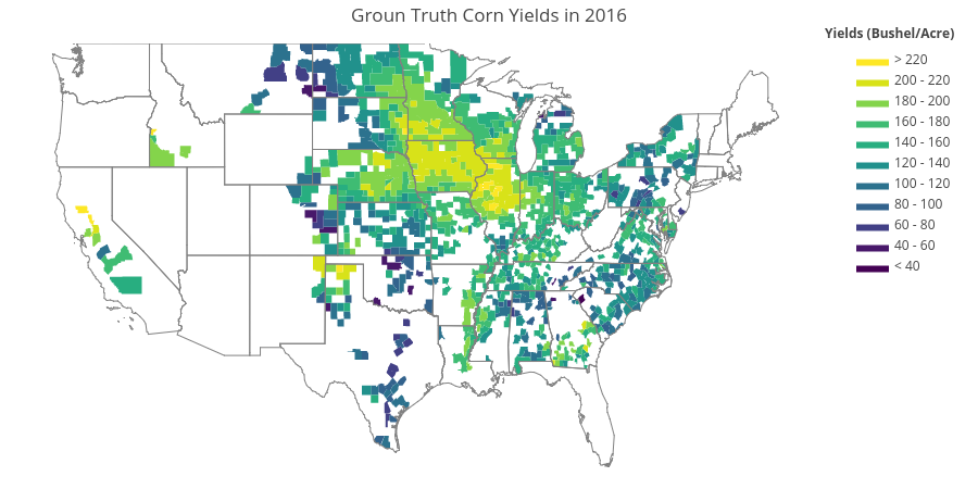
Fig. 8. The ground truth corn yields across U.S. in 2016 (test set).
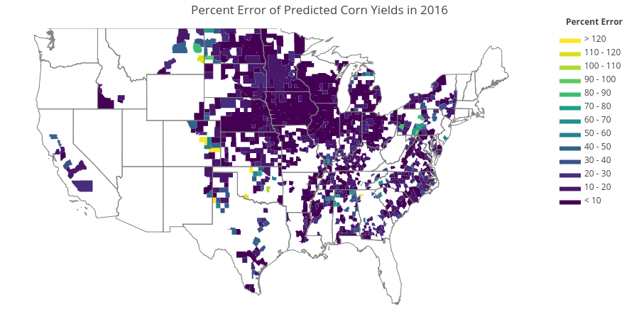
Fig. 9. The percent error of the predicted value from the ground truth.
5.
Reducing the Number of Frames
per Year
In
this section we want to investigate how early can we predict the yields. Figure
10 shows the MAE of predicted corn yields in year 2016 using different number
of frames. Note that frame 0 start in March and frame 38 is at the end of the
year. The result shows that as the number of frames increases, the lower the
margin error is as one would expected. Notably, we can see that by using just
20 frames (roughly 2nd week of Aug.), we can already achieve percent
error as low as 14.57% (compared to 10.46% if we use the images from the entire
year). This is about 2 months before corn is typically harvested in October,
although this could even be later in the year in warmer states. Therefore, this
model would allow user to be able to predict corn yields at county level early
in the season.
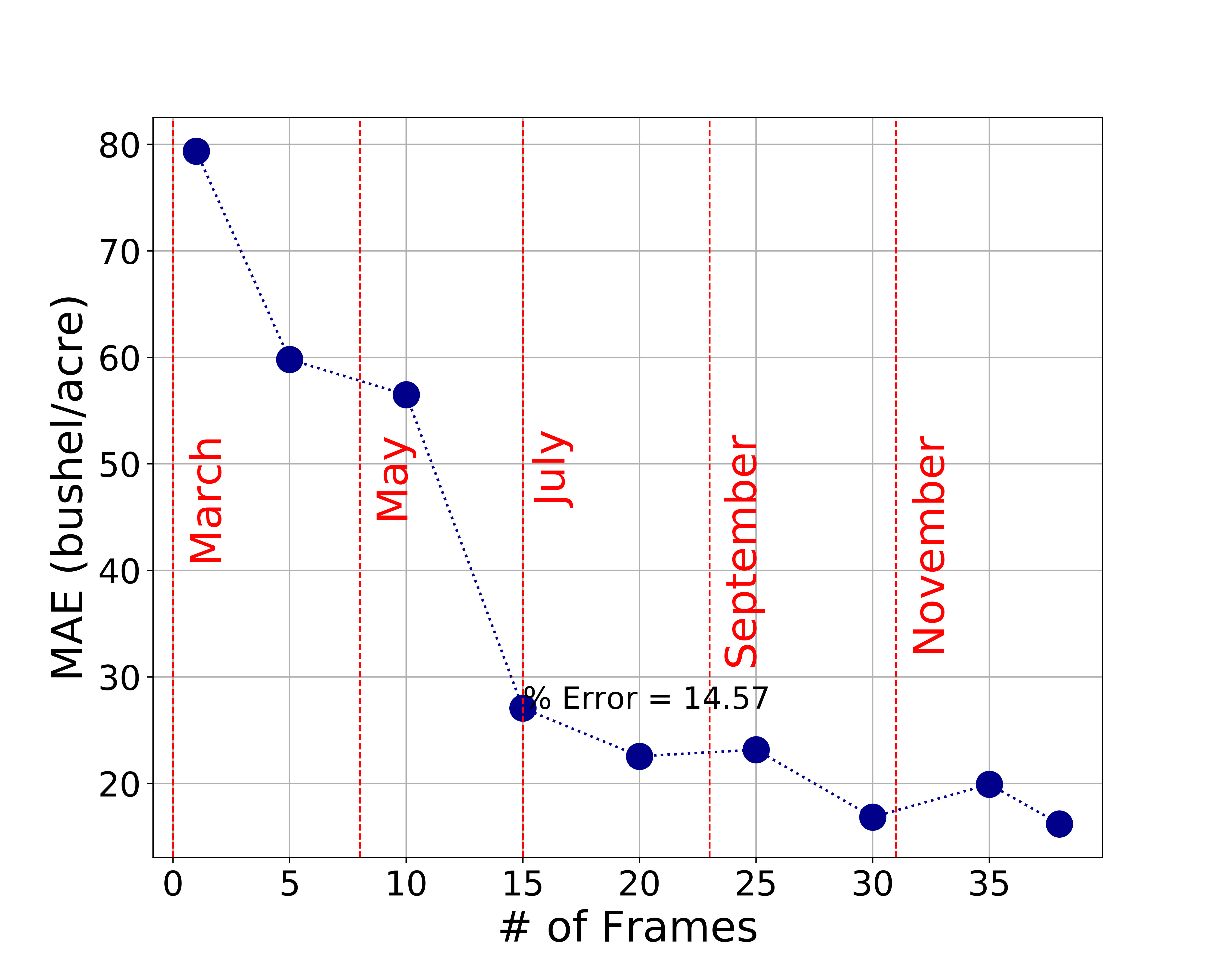
Fig. 10. The mean absolute error (MAE) of the model using different number of frames input per year with using just 20 frames per year (August) is sufficient to predict with only 15% error from the mean value of yields in year 2016.
6.
Conclusions
In the present study, we have shown the correlation between different satellite images including reflectance, land temperature, and land moisture to corn yields in U.S. We leveraged these correlations to construct a model that can capture both spatial and temporal information of these data to predict corn yields in a year. The best performing model on the test set (corn yields in year 2016) is ConvLSTM with percent error from the mean yields of only 10.46%. To enable early prediction, we lower the number of frames required per year (from the maximum of 38 frames). The results show that we can still get a god model performance down to just 20 frames, which corresponds to the month of August. This would have strong implications on business model of agricultural distributions and related-industry.
In the future, the study could be improved by incorporating the classification model into it so that it can automatically mask the interested crop before predicting the yields. Up-sampling of certain yield values could be applied (such as those of extremely low yields in this study). Lastly, it would be interesting to expand the model to do prediction of multiple crops as well.
7.
References
[1] Rustowicz,
Rose M. "Crop Classification with Multi-Temporal Satellite Imagery."
[2] National Agriculture in the
Classroom. A look at iowa agriculture. 2016.
[3] Usual
Planting and Harvesting Dates for U.S. Field Crops 1997.
[4] Sabini,
Mark, Gili Rusak, and Brad Ross. "Understanding Satellite-Imagery-Based
Crop Yield Predictions." (2017).
[5] Xingjian, S. H. I., et al. "Convolutional LSTM
network: A machine learning approach for precipitation nowcasting." Advances
in neural information processing systems. 2015.